Bootstrap Grid System
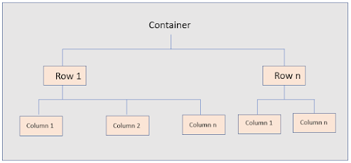
Bootstrap Grid System is a responsive layout made up of containers, rows and columns. Containers are the wrapper inside which the rows and columns resides as shown in the image:
 |
| DOM level Hierarchy of containers, rows and columns |
So, Containers are the wrappers containing rows. Rows are used to define a new row which would consist of columns (boxes) inside them.
Bootstrap Grid Layout Example
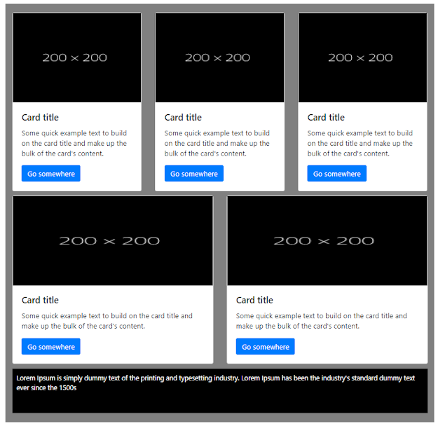
Consider below layout:
 |
| Bootstrap Grid Layout Example |
This layout is having 3 rows and we have 3 boxes in the first row, 2 boxes in second row and 1 box in last row.
Container, Container fluid, Row and col-* classes
In Bootstrap, this will have a container. Inside the container, there will be 3 rows, and inside the rows there will be columns for these boxes. Now, you might be wondering how to make container, rows and columns...right? For that there are bootstrap classes container, container-fluid, row and col-* classes.
Bootstrap Container Classes
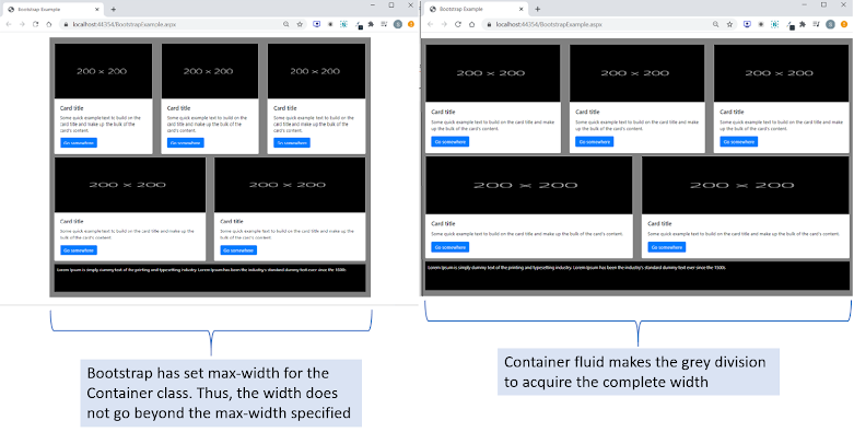
There are 2 classes in Bootstrap to define a container. They are container and container-fluid. The difference between both is that container class has a maximum width defined in px whereas container-fluid extends till the available width of the screen.
Container vs Container Fluid
 |
| Difference Between Bootstrap Container and Container Fluid |
If you want different max-width than what it is specified by bootstrap, you can use the class container-fluid instead of container and specify a max-width as per your design.
So, to get the layout as in the image - Bootstrap Grid Layout Example, the HTML code for the container would be:
 |
| HTML Code for Container Division |
Bootstrap Row Class
This class is used to start a new row. The HTML code for the row element would be:
 |
| HTML Code for Bootstrap Row Element |
Add this inside the container division, the final code would be:
 |
| HTML code after adding row inside the container |
Gutter Space
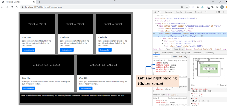
If you might have noticed, bootstrap applies left and right padding to the container class. Bootstrap also applies left and right padding to the col-* class. Well, this space is known as the gutter space.
Bootstrap applies negative margin-left and margin-right to the row class to nullify the gutter space so that the left and right padding won't get summed up for the col-* class and the container class. The margin values will be equal to the gutter space.
To have a better understanding of these spaces, inspect the row and container and look into the web inspector how the spaces are applied.
 |
| Bootstrap Gutter Space |
Bootstrap Column Classes (col-*)
The boxes inside this row will be elements with the col-* class. * refers to number of columns to be covered. In the example, we want 3 boxes in a row. A bootstrap grid consists of maximum 12 columns so, 12 columns would be divided by 3 which is 4. So, we will apply col-4 to the box's division.
For your better understanding, I have shown how the bootstrap columns can be imagined while writing the code in below image:
 |
| 3 Boxes inside a Bootstrap Row |
So, the HTML code for this column division would be:
 |
| HTML code for the column division |
Thus, the HTML code for this row would be:
 |
| HTML code for the first row with 3 boxes |
If you want reference for the card layout, here is the url: Bootstrap Lessons: Lesson 1 - Bootstrap & its Integration
For the next row with 2 boxes, the column class would be col-6, as the 12 columns are supposed to be divided among the 2 boxes as shown below:
 |
| The way 2 boxes are aligned inside 12 bootstrap columns |
The 3rd row with one column can be imagined something like below:
 |
| Row with one box |
I would like you to write code for these. If you get stuck somewhere, please write me at info@beawesomewithprogramming.co.in.
There are more column classes for different devices/breakpoints. We will look into these classes in next lesson.
