About me

I am a full stack .net developer with 5 years of experience in front-end and back-end technologies like HTML, CSS, Jquery, Angular, Typescript, Bootstrap, C#, MSSQL and Mongodb. I have done bachelor's in computer engineering from Gujarat Technological University. I have worked on web applications, Web APIs, Windows Forms, Web Forms, Tray applications and corporate websites. Programming is my hobby and I have starting writing blog to provide a platform for those who want to grow their career as a fullstack .NET developers.

Click here to know more about me

Media Queries


Purpose of Media Queries

CSS3 media queries are a set of rules that allow us to make a responsive website design by writing CSS for different devices according to the screen width or orientation. Using media queries we design web pages that work for desktops, laptops, tablets, and mobile phones.

Media Query Syntax
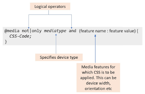
Syntax of Media Queries

Media Query Modifiers or Logical Operators

not - This is used when we want to write queries for some exceptions. i.e using not will apply to the devices not matching the media type and expression mentioned in the media query.

only - This is used when we want to write queries for some specific media type and expression.

and - combines media types and expressions for the CSS to be applied.

Media Type

The media type defines the device range for which the CSS is to be applied. Media types can have the following values:

Media Types: all, print and screen

Media Features or Expressions

Media features or Expressions are used to define features of the user agent or display device. They are written as (feature name: feature value) or (feature name >= | <= feature value)

Some examples of media queries

Examples of media queries

The above are some of the boring examples, let us try an interesting task to have a better understanding.

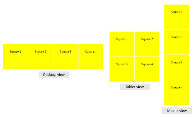
Consider that there are four squares and we want them to align differently on desktop, tablet, and mobile device as shown below:

Alignment of squares for different views

First, let us create the desktop layout. CSS for that would be:

CSS for desktop layout

For the tablet view, we have to set breakpoints through media queries for the screen size of the tablet. The tablet/small devices screen sizes range in between 768px to 991px. So, the CSS for the tablet layout would be:

CSS for tablet layout

The width of mobile devices lie below 767px so the CSS would be:

CSS for mobile layout
CSS for desktop layout

Media queries will not work if the below meta tag is not included inside the head tag:


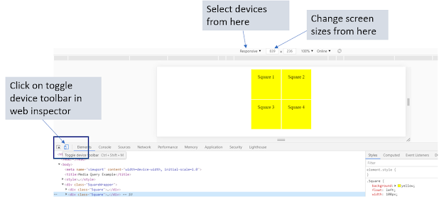
Here, width=device-width will set the width of the screen to the device's width, and initial-scale=1 sets the zoom value to 1. After writing the entire code, check the web page by selecting different devices as below:

Checking responsive websites from the web inspector

If you want to explore more about the media queries, you can refer to www.w3.org. For any queries or feedback, you can reach out to me at info@beawesomewithprogramming.co.in

Subscribe to Be a full stack .NET developer by Email